20 years of the PÖTTINGER website
Continuous technical and content-related development of the the company's internet presence
It is with great pride that PÖTTINGER can look back on 20 years of its website being online. Since 1997 we have continuously developed the website in terms of technology and content in order to present the very latest products, and offer our customers and dealerships the highest quality of information.
Responsive display for mobile devices
Since a major update in February 2014, PÖTTINGER has been using responsive design (adaptation to any size of screen) to accommodate the increasing number of smartphone and tablet users and provide a clear and intuitive design.
To meet the demands of international growth of the company, the website was also divided up into country-specific sites.
After 20 years of the website being online, PÖTTINGER would like to thank you for the trust you have placed in us and hopes you will continue to visit our website on a regular basis!
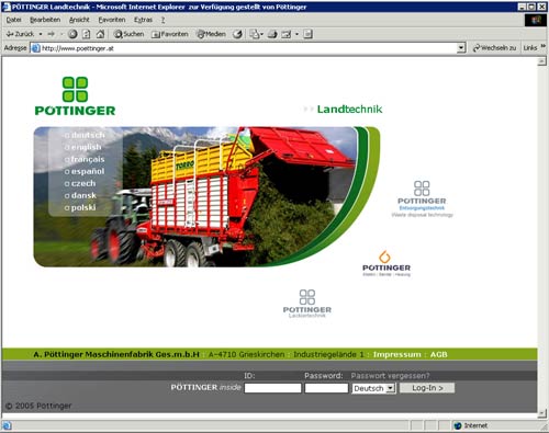
1997
-
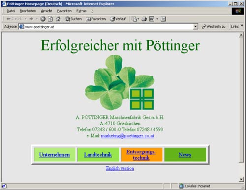
1. PÖTTINGER website
On 01 May 1997 PÖTTINGER stepped into the digital age with www.poettinger.at. With the start page and four sub pages, the information content was manageable. Having your own email address was a completely new concept for most people.
1998
-
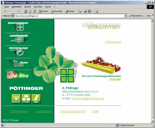
Visual and content improvement
PÖTTINGER recognises the importance of an online presence and makes major additions to image to content.
2002
-
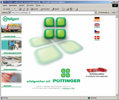
New logo, new appearance
PÖTTINGER gets a new corporate design, which is reflected in the appearance of the website. Everything is softer and more rounded. German and English are joined by other languages.
2004
-
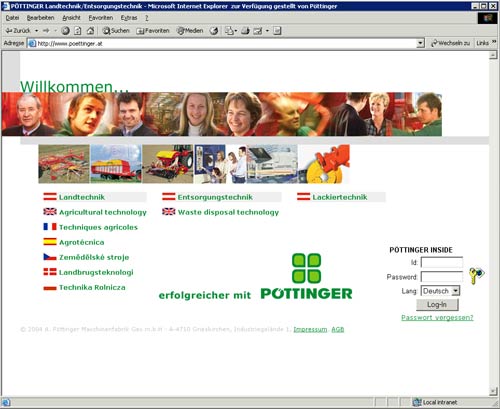
Customer care becomes a priority
PÖTTINGER focusses even more on the needs of customers. The addition of new languages and new functions such as a contact assistant make it easier to stay in touch.
2008
-
Dynamic design takes off
With the help of an advertising agency that specialises in online media, a new feel was implemented featuring improved user friendliness and dynamic design. The number of visitors continued to go up, underlining the importance of the website.
2014
-
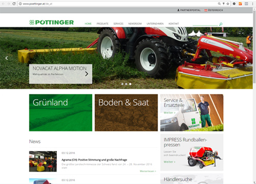
Relaunch with responsive design
The display of content on mobile devices such as smartphones and tablets has since become an enormously important factor. Around one third of visitors use mobile devices. PÖTTINGER supports this trend by relaunching the website with responsive design technology. At the same time, we switched from language-specific to country-specific sites so that we can provide even better service to each individual market.


![Newsletteranmeldung [en_nz]](/img/icons/Piktogramm_Newsletteranmeldung_30x30.png)